The interactivity of the AnalysisPageServer front end (rollover, zoom, tag, filter, sort, download, etc.) can be deployed on static data, without setting up a server. You provide an SVG file and a data frame to annotate the elements of that plot, and AnalysisPageServer does the rest of the work. You can include multiple data sets in one page. Each data set can have one or both plot and data.
Let's start with a simple scatter plot. We'll attach some string and numeric data to each point.
n <- 100
x <- rnorm(n)
y <- rnorm(n)
words <- rep(c("A","few","words"), length = n)
numbers <- rep(c(42, pi, 3, -1), length = n)
col <- rep(c("red","orange","yellow","green","blue","purple"), length = n)

scatter.data <- data.frame(x = x,
                           y = y,
                           words = words,
                           numbers = numbers,
                           colors = col)
head(scatter.data)
##            x          y words   numbers colors
## 1 -1.2398746  1.0681849     A 42.000000    red
## 2 -0.9122100  1.8222945   few  3.141593 orange
## 3  1.7607919 -1.5680951 words  3.000000 yellow
## 4  0.2952596  0.2141517     A -1.000000  green
## 5  0.7053558  0.9607324   few 42.000000   blue
## 6  0.1559528 -0.4627676 words  3.141593 purple
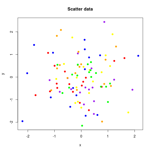
Now let's make a little plot
plot(x, y, main = "Scatter data", pch = 19, col = col)
OK. Now redo the plot but save it to an SVG file.
plotfile <- tempfile(fileext = ".svg")
svg(plotfile, width = 9, height = 7)
plot(x, y, main = "Scatter data", pch = 19, col = col)
dev.off()
Now that you have data and an SVG plot, you are ready to make it interactive.
Use static.analysis.page.
library(AnalysisPageServer)
result <- static.analysis.page(outdir = "static-example",
                               svg.files = plotfile,
                               dfs = scatter.data,
                               show.xy = TRUE,
                               title = "Random scatter data")
static.analysis.page consists of the following steps:
The return value is a list with $URL and $paths.list components. The $URL gives a URL that you can open in the browser and
$paths.list is a list with one entry for each dataset giving the
paths to its plot (.svg) and data (.json) files. (In this example
there is only one dataset, so $paths.list has length one, but see the
section below on including multiple datasets.)
result
## $URL
## [1] "file:///tmp/RtmpHZiyKJ/Rbuild589f299e7c3b/AnalysisPageServer/vignettes/static-example/analysis-page-server-static.html#datasets?dataset1.plot_url=data%2Fdataset%2D1%2Esvg&dataset1.data_url=data%2Fdataset%2D1%2Ejson"
##
## $paths.list
## $paths.list[[1]]
## $paths.list[[1]]$plot
## [1] "data/dataset-1.svg"
##
## $paths.list[[1]]$data
## [1] "data/dataset-1.json"
This link opens the example data set in a new window:
If you are following along in your own R session you can open the link like this:
browseURL(result$URL)
The client-side of the AnalysisPageServer make
many interactions possible to explore your data. The
AnalysisPageServer Interactivity page works
demonstrates these.
If you have more than one dataset then you can pass them both to the front end to generate a richer report page.
Some of the datasets could have a plot with no data, or just data with no plot.
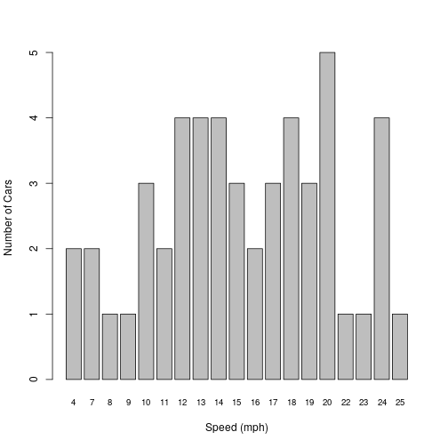
As an example, we'll make a barplot and some data with no plot. We'll
use the cars dataset. This is one of the datasets that comes packaged
with R. It is a data frame with one row for each car measured. The
measurements were the speed at which the car was moving and the distance
required to stop.
head(cars)
##   speed dist
## 1     4    2
## 2     4   10
## 3     7    4
## 4     7   22
## 5     8   16
## 6     9   10
We are going to look at the speed distribution---how many cars were going at each speed. This will be a barplot, but it would be nice to roll over each bar and get some summary statistics about the stopping distances for the cars at that speed.
## List of stopping distances for cars at each speed
dist.by.speed <- split(cars$dist, cars$speed)
## Average stopping distance for each speed (vector)
avg.dist <- sapply(dist.by.speed, mean)
## Number of measurements taken at each speed (vector)
n.at.speed <- sapply(dist.by.speed, length)
## Number of distinct speeds observed
n.speeds <- length(dist.by.speed)
## x-coordinates for bars in plot
x <- 1:n.speeds
## y-coordinates for bars in plot. For barplots the elements are
## recorded by their bottom coordinates, which are all 0 here
y <- rep(0, n.speeds)

barplot(n.at.speed, ylab = "Number of Cars", xlab = "Speed (mph)",
  cex.names=0.8)
Now reorganize the cars data so that it is a data frame with row corresponding to each bar in the barplot, that is to each different speed. We'll also attach a summary of the stopping distances for all the cars observed at that speed.
dist.summaries <- t(sapply(dist.by.speed, summary))
colnames(dist.summaries) <- paste(colnames(dist.summaries), "Dist")
cars.data <- data.frame(x = x, y = y,
  speed = as.integer(names(avg.dist)), n = n.at.speed,
  dist.summaries, check.names = FALSE)
head(cars.data)
##    x y speed n Min. Dist 1st Qu. Dist Median Dist Mean Dist 3rd Qu. Dist
## 4  1 0     4 2         2         4.00         6.0       6.0         8.00
## 7  2 0     7 2         4         8.50        13.0      13.0        17.50
## 8  3 0     8 1        16        16.00        16.0      16.0        16.00
## 9  4 0     9 1        10        10.00        10.0      10.0        10.00
## 10 5 0    10 3        18        22.00        26.0      26.0        30.00
## 11 6 0    11 2        17        19.75        22.5      22.5        25.25
##    Max. Dist
## 4         10
## 7         22
## 8         16
## 9         10
## 10        34
## 11        28
Now we'll save the plot to an SVG.
Note: In this document you can see I'm plotting once without opening a device and then again to the SVG. In a real interactive session that pattern might also be useful, to check how your plot looks before writing the SVG, but only the second part, writing the SVG, is actually required.
plotfile2 <- tempfile(fileext = ".svg")
svg(filename = plotfile2, width = 9, height = 7)
barplot(n.at.speed, ylab = "Number of Cars", xlab = "Speed (mph)",
  cex.names=0.8)
dev.off()
I promised we'd include in this example a dataset that had only data
and no plot. Let's use the iris dataset from R.
head(iris)
##   Sepal.Length Sepal.Width Petal.Length Petal.Width Species
## 1          5.1         3.5          1.4         0.2  setosa
## 2          4.9         3.0          1.4         0.2  setosa
## 3          4.7         3.2          1.3         0.2  setosa
## 4          4.6         3.1          1.5         0.2  setosa
## 5          5.0         3.6          1.4         0.2  setosa
## 6          5.4         3.9          1.7         0.4  setosa
To include a data frame without a plot, just
put an NA in the corresponding position of svg.files.
Now let's put it all together.
svg.files <- c(plotfile, plotfile2, NA)
dfs <- list(scatter.data, cars.data, iris)
captions <- c("Random scatter data", "A summarization of the cars
dataset from R", "The iris data")

## We'll show the XY coordinates for the scatter data, where they have
## some meaning in interpreting the data, but not for the barplot,
## where they are only used to locate the plotted elements. The
## third element of show.xy is ignored since there is no plot.
result <- static.analysis.page(outdir = "static-example2",
                     svg.files = svg.files,
                     dfs = dfs,
                     show.xy = c(TRUE, FALSE, TRUE),
                     title = captions)
result
## $URL
## [1] "file:///tmp/RtmpHZiyKJ/Rbuild589f299e7c3b/AnalysisPageServer/vignettes/static-example2/analysis-page-server-static.html#datasets?dataset1.plot_url=data%2Fdataset%2D2%2Esvg&dataset1.data_url=data%2Fdataset%2D2%2Ejson&dataset2.plot_url=data%2Fdataset%2D3%2Esvg&dataset2.data_url=data%2Fdataset%2D3%2Ejson&dataset3.data_url=data%2Fdataset%2D4%2Ejson"
##
## $paths.list
## $paths.list[[1]]
## $paths.list[[1]]$plot
## [1] "data/dataset-2.svg"
##
## $paths.list[[1]]$data
## [1] "data/dataset-2.json"
##
##
## $paths.list[[2]]
## $paths.list[[2]]$plot
## [1] "data/dataset-3.svg"
##
## $paths.list[[2]]$data
## [1] "data/dataset-3.json"
##
##
## $paths.list[[3]]
## $paths.list[[3]]$data
## [1] "data/dataset-4.json"
Follow the link to open this three-data set example in a new window. To see the second or third data sets either scroll down or click on the "Data Sets" menu in the corner.
This example shows how to annotate a heatmap or image. The only
trick here is that you need to know the order of the cells that the
graphics devices generates.
Note: If you are ever confused about the order of plotting, just make the SVG and then open it in a web browser. Do a right-click
inspect elementand you can scroll through the SVG source and watch the corresponding elements pop up.
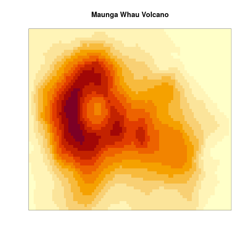
We will use the volcano dataset from R. It is a beautiful matrix giving the height of a volcano at different points. Ploting the heights as a heatmap reveals the location of the volcano's caldera.
image(volcano, xaxt = "n", yaxt = "n", main = "Maunga Whau Volcano")
 Now the trick is that we have to take this square matrix and re-cast
it into a data frame with one row per cell. The secret is that the
Now the trick is that we have to take this square matrix and re-cast
it into a data frame with one row per cell. The secret is that the y
coordinates run faster than the x, and start in the bottom left.
x <- rep(1:nrow(volcano), each = ncol(volcano))
y <- rep(1:ncol(volcano), nrow(volcano))
volcano.cells <- data.frame(x = x, y = y, Height = as.vector(t(volcano)))
head(volcano.cells)
##   x y Height
## 1 1 1    100
## 2 1 2    100
## 3 1 3    101
## 4 1 4    101
## 5 1 5    101
## 6 1 6    101
And now let's redo the plot and make the analysis page:
plotfile3 <- tempfile(fileext = ".svg")
svg(filename = plotfile3, width = 9, height = 7)
image(volcano, xaxt = "n", yaxt = "n", main = "Maunga Whau Volcano")
dev.off()
result <- static.analysis.page(outdir = "static-example3",
                     svg.files = plotfile3,
                     dfs = volcano.cells,
                     show.xy = TRUE,
                     title = "Maunga Whau Volcano")
result
This example uses ggplot2 to generate a multi-panel plot.
Because the plot has multiple panels the SVG elements will no longer
be consecutive so you'll have to tell static.analysis.page
how many points are in each panel. It looks for the first group,
then starts looking for the next group where it left off looking for
the first group. This example uses the mtcars dataset.
library(ggplot2)
plotfile4 <- tempfile(fileext = ".svg")
svg(filename = plotfile4, width = 7, height = 7)
p <- ggplot(mtcars, aes(mpg, wt)) + geom_point()
p + facet_grid(vs ~ am)
dev.off()
We do need to do some preparation of the data frame
before calling static.analysis.page(). The first
two columns have to be the x and y coordinates, so that
will be mpg and wt:
df <- mtcars
xy.fields <- c("mpg", "wt")
df <- df[c(xy.fields, setdiff(names(df), xy.fields))]
head(df)
##                    mpg    wt cyl disp  hp drat  qsec vs am gear carb
## Mazda RX4         21.0 2.620   6  160 110 3.90 16.46  0  1    4    4
## Mazda RX4 Wag     21.0 2.875   6  160 110 3.90 17.02  0  1    4    4
## Datsun 710        22.8 2.320   4  108  93 3.85 18.61  1  1    4    1
## Hornet 4 Drive    21.4 3.215   6  258 110 3.08 19.44  1  0    3    1
## Hornet Sportabout 18.7 3.440   8  360 175 3.15 17.02  0  0    3    2
## Valiant           18.1 3.460   6  225 105 2.76 20.22  1  0    3    1
We have to plot them first
in order of the vs and am fields, so the rows will
also have to be reordered. split() and rbind()
can do this::
groups <- unname(split(df, list(df$vs, df$am)))
df <- do.call(rbind, groups)
Finally we'll have to tell static.analysis.page() the
number of points in each panel:
group.lens <- sapply(groups, nrow)
Now we can write out the page:
result <- static.analysis.page(outdir = "static-example4",
                               svg.files = plotfile4,
                               dfs = df,
                               show.xy = TRUE,
                               title = "Motor Trend Cars Data",
                               group.length.vecs = group.lens)