Quality Control for Spotted Arrays

April 15, 2008

Agnes Paquet1, Andrea Barczak1, (Jean) Yee Hwa Yang2

1. Department of Medicine, Functional Genomics Core Facility, University of California, San Francisco
paquetagnes@yahoo.com
2. School of Mathematics and Statistics, University of Sydney, Australia


 Content 

Hybridization quality control
This guide contains instruction on how to install arrayQuality and how to generate basic diagnostic plots to assess hybridization quality for two-color microarray data. Currently supported platforms are :
How customize arrayQuality 
Several default settings of arrayQuality can be modified to better fit the user's needs.  Advanced users can specify the following:
More details about how to customize your diagnostic plots can be found in a separate help file that can be accessed via the main help page.

Print-run quality
ArrayQuality provides two kinds of diagnostic plots for print-run quality control:
The complete description of these diagnostic plots and instructions on how to generate these plots can be found in the Print-Run QC user guide that can be accessed from the main help page.
 
MEEBO-HEEBO arrays
MEEBO and HEEBO arrays contain specific sets of controls, which can be used for quality purposes. ArrayQuality provides specific set of diagnostic plots for these arrays. Instructions about how to generate and interpret these plots are described in a separate help file that can be access from the package main help page. Please refer to this manual for more details.


1. Introduction to arrayQuality

ArrayQuality is a R package, available as part of Bioconductor, designed to help assessing quality of spotted array experiments at several stages of the microarray life cycle. It provides reports containing several plots and statistical measures that can help you determine if your hybridizations and slides are of good quality. More information about Bioconductor is available at http://www.bioconductor.org.

This guide provides an introduction to microarray quality and a description of the main functionalities of the package. A full description of the package is given by the individual function help documents available from the R online help system. To access the online help, type help(package=limma) at the R prompt or else start the html help system using help.start() or the Windows drop-down help menu.

2. Installing arrayQuality

2.1 Requirements

ArrayQuality is a library for the R project, part of Bioconductor. You will need to have R installed on your computer before installing arrayQuality. For more information about R, see the R project at http://www.r-project.org. ArrayQuality can work on different files at the same time, ONLY if they are from the SAME print-run (same GAL file). If you want to generate quality reports of slides from different print-runs, you need to place them in different folders, one for each print-run.

2.2 Installing arrayQuality

ArrayQuality can be installed from Bioconductor. The version from Bioconductor is updated every 6 months. 


3. Quick starting guide to arrayQuality

Here, we will discuss the components of the package aimed at verifying the performance of a hybridization, given the good quality of the slide, before any preprocessing steps or further quality assessment on individual spots are performed. If you are interested in the print-run or the MEEBO/HEEBO components, please refer to the appropriate help fike for these topics. 

Our package provides two kinds of quality control plots:

Diagnostic plots can be generated directly for output of the GenePix (.gpr files), Spot (.spot files) and Agilent image processing software packages. Most arguments can be customized to match your own data: which probes are used as controls, which columns of the image processing output file are used to define your spot types... You can also specify your own collection of good quality slides. More details on how to customize the package can be found in a separate user manual that you can access from the main help page..

3.1 To generate quality plots from image processing output files

We provide 3 main functions to generate quality plots: gpQuality(), spotQuality() and agQuality(). We will use gpQuality as an example, but the following can be directly applied to spotQuality or agQuality.
  1. Create a directory and move the image processing output files (e.g. .gpr files) of the slides of interest to this directory. Make sure that all files in the directory come from the SAME print-run (same GAL file).

  2. Start R, and change your R working directory to the one you have just created. In the R menu, select File, then click on “Change dir…”. Browse to your directory from the pop-up window, or enter it manually, and click OK. To double check that you are in the correct directory: in the File menu, click on “Display file(s)…”.

  3. To load the package in your R session: type
    library(arrayQuality)

    If needed, you may have to install other required packages like marray, limma, convert and hexbin.

  4. To generate both diagnostic plots and comparative boxplots on all files in the directory, type:
    result <- gpQuality(organism=”Mm”)

  5. To generate diagnostic plots only, run:
    result <- gpQuality(organism="Mm", compBoxplot="FALSE")
    In this case, quantitative quality measures will not be calculated and the HTML report will not be generated.

  6. To write down your quantitative quality measures and your normalized data to a file: set output = TRUE when calling gpQuality:
    result <- gpQuality(organism="Mm", output=TRUE)

  7. By default, arrayQuality uses print-tip loess normalization. If you prefer to use another method, you can specify it in the norm argument:
    result <- gpQuality(norm="none")
    For more details about normalization methods, please refer to marray package help.

3.2 To generate quality plots from marrayRaw or RGList objects

You can use the function maQualityPlots() to generate diagnostic plots directly from your R object.

3.3 Results

gpQuality, spotQuality and agQuality output:

4. Introduction to microarray quality

A microarray experiment is composed of several steps, including experimental design, sample preparation, and various statistical analyses (figure 1). They are represented in the microarray life cycle below. As microarray technology is complex and sensitive, it is important to assess the performance of each step before going to the next one. In addition, this is also a good way to trace back the cycle to understand potential causes for upstream problems.

microarray experiment lifecycle
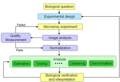
Figure 1: Microarray experiment life cycle

For spotted array experiments, quality controls can be summarized into 4 steps:
  1. Print quality
  2. mRNA quality
  3. Array hybridization quality
  4. Spot quality
Each step must be performed in a sequential order, as represented in Figure 2.

Quality control steps for microarray experiment

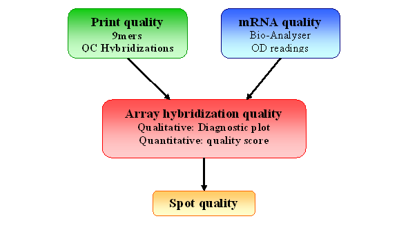
Figure 2: Quality Control for spotted arrays experiment

Our package provides graphical tools to look at two of these components: print-run quality and array hybridization quality.
  1. Print quality
    This component is highly tailored to the Shared Genomics Core Facility at UCSF, but the framework can be adapted to other Core facilities or laboratories printing their arrays. It is an essential component of a printed array experiment, as any print pin, probe or slide surface defect will affect the quality of hybridization to the slide, and this can’t be fixed by statistics. Only prints that did pass the quality control check will be used for actual hybridization.

  2. Hybridization quality
    This is a global assessment of the hybridization performance. It helps determine for example any problem with the dyes, or uneven hybridization. Then, once you have determined that your hybridization is good, you can look at each individual spot quality, remove bad spots, and perform statistical analysis.

4. General hybridization quality 

This component is aimed at verifying the performance of your hybridization, given the good quality of the slide, before any preprocessing steps or further quality assessment on individual spots. This is where you determine if your experiment quality is good enough for you array to enter your dataset. For example, you will need to remove any hybridization with very low SNR, or large spatial artifacts.

Our package provides two kinds of quality control plots. The first one is a qualitative quality control measurement as a diagnostic plot. It is a quick visual way to determine hybridization quality gathering information from several statistical tools. More details on individual diagnostic plots can be found in the vignette “marrayPlots” in the package marray. The second one is a more quantitative comparison of slide quality. We extract some statistical measures from the test slide and we compare them against results obtained for a collection of slides of “good quality” to assess the quality of the hybridization. This comparison is visualized through a comparative boxplot. Results are displayed in a HTML report. Figure 5 shows a screen shot of a typical HTML report. Users can click on each image to obtain a higher resolution plot.

Diagnostic plots can be generated  for different image processing software format: GenePix format files (.gpr files), Spot format files (.spot) and Agilent format files, or from marrayRaw or RGList objects. Most arguments can also be customized to match your own data: which probes are used as controls, which column of the image processing output file is used to define your spot types... You can also specify your own collection of good quality slides using the functions globalQuality and qualRefTable. For more details about these functions, please refer to the specific online help.

4.1 To generate quality plots from gpr files: gpQuality()

We provide 3 main functions to generate quality plots: gpQuality(), spotQuality() and agQuality(). We will use gpQuality as an example, but the following can be directly applied to spotQuality or agQuality. gpQuality()will generate both diagnostic plots and comparative boxplots. It uses by default spot types from the Functional Genomics Core Facility in UCSF. To use your own spot types, please refer to the end of this Section. [TO BE REMOVED OR NOT]

-          Copy the gpr files from the SAME print-run (same GAL file) in a directory.

-          Change R working directory to the one containing your gpr files as described in Section 3

-          To generate both diagnostic plots and comparative boxplots on all files in the directory, run:
         > result <- gpQuality(organism=”Mm”)

 
       -          To generate diagnostic plots only, run:
                   >  result <- gpQuality(organism="Mm", compBoxplot="FALSE")
                   In this case, quantitative quality measures will not be calculated and the HTML report will not be generated.

- To write down your quantitative quality measures and your normalized data to a file: set output = TRUE when calling gpQuality:
         > result <- gpQuality(organism="Mm", output=TRUE)

This command will create two files: quality.txt, which contains your quality measures, and NormalizedData.xls, which contains your normalized M values.  

If you have set compBoxplot = FALSE, quantitative quality measures are not calculated. Therefore, you will not generate the quality.txt file.


4.2 To generate quality plots from marrayRaw/RGList objects: maQualityPlots

This function can be use to obtain quality plots for data generated with other image processing software, like Spot for example. maQualityPlots() will generate diagnostic plots only. It uses the spot types defined when creating the R object. To learn more about how to read data into a marrayRaw or a RGList object, please refer to marray or limma packages Vignettes.

-          To generate diagnostic plots: if rawdata is your marrayRaw/RGList object, type:
> maQualityPlots(rawdata) 


4.3 Results

gpQuality() outputs

For each slide, you will find on the report how many of your slide’s results are below the recommended range. If you want to specify a directory to store the results, you can do it by modifying the argument resdir accordingly. For more details about gpQuality arguments, please refer to the online help for this function.


Example of gpQuality HTML report
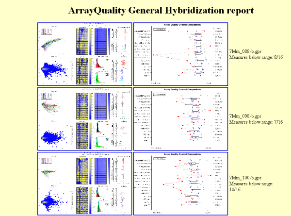
Figure 5: Example of HTML report generated by gpQuality


maQualityPlots()
outputs:

4.4 Restrictions

gpQuality calls two key functions, maQualityPlots and qualBoxplot. qualBoxplot supports Mouse (Mm) and Human (Hs) genomes only. To generate quality plots for other genomes, you need to set gpQuality argument compBoxplot = FALSE. In this case, only the diagnostic plots will be generated.


4.5 Description of the diagnostic plots:

Figure 6 represents an example of a good hybridization diagnostic plot.

  1. MA-plot of raw M. No background subtraction is performed. The colored lines represent the loess curves for each print-tip group. The red dots highlight  any spot with corresponding weighted value  less than 0. Users can create their own weigthing scheme or function. Things to look for in a MA-plot are saturation of spots and the trend of loess curves, which is an indicator of the amount of normalization to be performed.
  1. MA-plot of normalized data density. By default, print-tip loess normalization is used. Instead of the typical MA-plot, we have used the package "hexbin" to highlight density of dots on the MA-plot. A light yellow color indicates a high density of dots, whereas blue color represents a lower density. This plot gives you information on the bulk of your data intensity (low/high signal)
  1. Spatial plot of rank of raw M values (no background subtraction): Each spot is ranked according to its M value. We use a blue to yellow color scale,where blue represents the higher rank (1), and yellow represents the lower one. Missing spots are represented as white squares. This is a quick way to visually detect uneven hybridization and missing spots.
  1. Spatial plot of normalized M values ranks. By default, print-tip loess normalization is used. Each spot is ranked according to its M value. We use a blue to yellow color scale,where blue represents the higher rank (1), and yellow represents the lower one. Missing spots are represented as white squares. In addition, flagged spots are higllighted by a black square. This type of graphical representation helps verify that normalization removed any spatial effects.
  1. Spatial plot of raw A values. The color indicates the strength of the signal intensity, i.e. the darker the color, the stronger the signal. Missing spots are represented in white.
  1. Histogram of the signal-to-noise log-ratio (SNR) for Cy5 and Cy3 channels. The mean and the variance of the signal are printed on top of the histogram. In addition, overlay density of SNR stratified by different control types (status) are highlighted. Their color schemes are provided in Table 1. The SNR is a good indicator for dye problems. The negative and empty controls density lines should be closer, almost superimposed.
  1. Dot plot of controls normalized M values. Controls with more than 3 replicates are represented on the Y-axis, the color scheme is represented in Table 1. Controls M values should be tight. and close to 0.
  1. Dot plot of controls A values, without background subtraction. Controls with more than 3 replicates are represented on the Y-axis, the color scheme is represented in Table 1. Intensity of positive controls should be in the high-intensity region, negative and empty controls should be in the lower intensity region. Positive controls range and negative/empty controls range should be separated.

4.6 Description of the comparative boxplot:

Figure 7 shows an example of a comparative boxplot.

We have chosen a wide range of measures to quantify the quality of a typical hybridization: single channel measures (range of foreground signal, MAD of background, signal to noise ratio…), two channel measures (median A values for each type of controls, amount of normalization needed…), percentage of flagged spots... Some measures have been negated such that the quality scale had an increasing trend from problematic to good quality.

For each measure, we have represented the following on the graph :

-         Boxplot of the reference slides values.

-        1st and 3rd quantiles before scaling for each boxplot.

-         Y-axis on the right : for each measure, we have printed 2 values. The first one is the percentage of reference slides measures under your slide’s result. The second one is your slide value for this measure before scaling.

      -    We have scaled all the results to be able to compare them on the same graph.  

      -   The red dots are the test slide scaled values

 
The 15 measures we have selected are presented in the table below.

Unless otherwise specified:

Cy5fgmedian corresponds to the "F635 Median" column of the gpr file.
Cy3fgmedian corresponds to the "F532 Median" column of the gpr file.
Cy5fgmean corresponds to the "F635 Mean" column of the gpr file.
Cy3fgmean corresponds to the "F532 Mean" column of the gpr file.
Cy5bg corresponds to the "B635 Median" column of the gpr file.
Cy3bg corresponds to the "B532 Median" column of the gpr file.
M = log2(Cy5fgmedian) - log2(Cy3fgmedian)
A = [log2(Cy5fgmedian) + log2(Cy3fg median)] / 2.


Name

Descriptions

Details

1

rangeRf

Range of Cy5 foreground.

max(log2 Cy5fgmedian ­)­ ­– min(log2 Cy5fgmedian) .

2

rangeGf

Range of Cy3 foreground.

max(log2 Cy3fgmedian ­)­ ­– min(log2 Cy3fgmedian).

3

madRb

MAD of Cy5 background.

-mad(log2 Cy5bg).

4

madGb

MAD of Cy3 background.

-mad(log2 Cy3bg) .

5

medRS2N

Median signal to noise log-ratio for Cy5.

median(RS2N) with RS2N = log2(Cy5fgmean /Cy5bg ).

6

medGS2N

Median signal to noise log-ratio for Cy3.

median(GS2N) with GS2N = log2(Cy3fgmean / Cy3bg ).

7

medA_empty

Median A values of empty control.

- median A[empty] where “empty” refers to the set of control probes labeled "empty".

8

medA_negative

Median A values of negative control.

- median A[negative] where “negative” refers to the set of control probes labeled "negative".

9

medA_positive

Median A values of positive control.

- median A[positive] where “positive” refers to the set of control probes labeled "positive".

10

diffA_pos-neg

Difference between A values for positive and negative controls.

median A[positive] - median A[negative]

11

msePTip:

MSE of M values by print-tip group, no background subtraction.

 MSE = mean squared error

12

mseFit

MSE of lowess curve

fit = lowess(A, M) 
mseFit = MSE(fit$y) (as defined in measure 11)

13

percentFlag

Determine the percentage of spots with flag less than 0.

Flag is the information from the “Flags” column of the gpr file. 

14

madMMR

Log-ratio of M values calculated using mean and median.

-[log2(Cy5fgmean / Cy3fgmean) - log2(Cy5fgmedian / Cy3fgmedian)]

15

–extremeMMR

Percentage of spots with abs[MMR] > 0.5

MMR as defined in measure 14. 


4.7 Example

Data for this example was provided by the Functional Genomics Core Facility in UCSF. We have tested slide number "137" from print-run "9Mm". This array was fabricated using Operon Version 2 Mouse oligos and the hybridization measures differential gene expression in two RNA samples, Mouse Liver and Mouse Reference Pool. Results are represented Figure 5 and Figure 6.

To generate diagnostic plots, comparative boxplots, HTML report and to write your quality measure and normalized data to a file in a directory named "Results":

> library(arrayQuality)

> datadir <- system.file("gprQCData", package="arrayQuality")

> result <- gpQuality(fnames = "9Mm137.gpr", path = datadir,organism = ”Mm”, output = TRUE, resdir = "Results")


Example of general hybridization diagnostic plot
 
Figure 6: General hybridization quality diagnostic plot


General hybridization quality: comparative boxplot

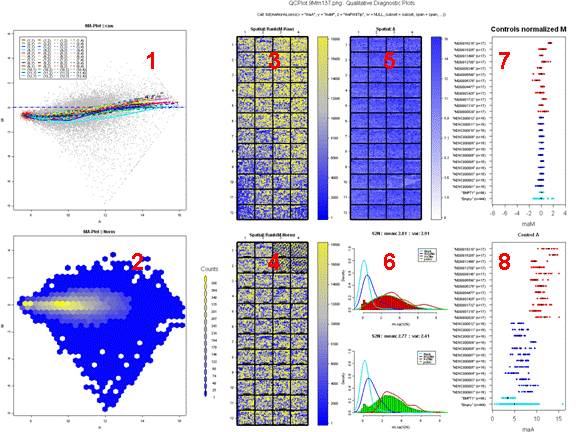
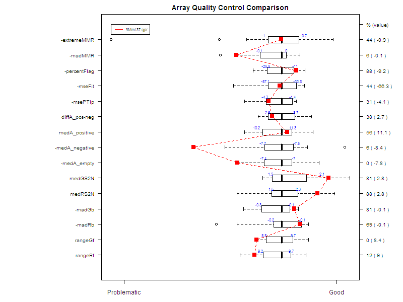
Figure 7: Comparative boxplot